Friday 13 February 2015

Paper art food reasurch - applied animation

One Thing i would like to try and use is paper in my animation, and the possibility of making a stop motion through re-creating the food, and/or characters in my final animation to help better get the message i am trying to portray across. 

I want to try and incorporate paper in some way to help experiment with techniques and i feel by using this type of medium it would be possible to over exaggerate messages in the animation and the use of materials could vairy from recycled materials like re, using packaging, found paper and objects and also a good way to make a striking animation with colours. 

This may change as making such things out of paper may be very difficult to make and also animate depending what it is make from so although i would like to do 3D stop motion i may move towards 2D or a mix, trying to understand after effects more also to push the messages and story further.


I liked this piece as it has a direct interpretation of the food it is re-creating next to it, using relatively simple 3D shapes but yet using very striking colours giving it such a hand made appeal.  


I found this advertisement very striking, with the use of colours and simple photography. I wold like to play around with colours when representing the vegetables as i want to focus my animation around the pro's of eating local organic food. This could possibly help me visually show the difference when it comes to how it is grown, the chemicals in some exported food and the nutritional differences. 

I want to experiment with making the shapes of the fruit out the paper but not sure how to go about making a paper template so it will take some experimentation of different techniques in making them look real enough to identify with. 


This is a relatively simple advert, mixing 2D and 3D paper crafts to take the photo and advertise this particular food festival. 


Zim and Zou are huge influences for me in paper animation at the moment creating such beautiful objects out of paper. The way the colours have been played around with by this artist really appeal to me, each thing is still easily to identify but adds a very fantasy style to them. I would like to play with colour in this way maybe to help show how the veg shipped are pumped with chemicals to make them look so big and delicious but through that loosing a lot of there nutritious value.


These piece of work by zim and zou were for a magazine about vitamins, which in a way is very relevant to what im doing, they created two pills with the first having natural veg falling out of it to show all the vitamins in it for medicine and the second a more darker side with all the money made in cosmetic medication.


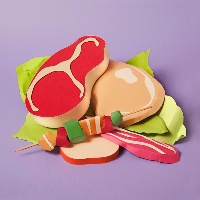
There style very much carries through making alot of it very easily recognisable as there work, like this paper BBQ, which has a very graphic feel to it, but also being beautifully 3 diminutional. 


The colours in a lot of the work is very bold and in your face with this futuristic burger full of so many different elements and pieces to put it together, representing well how everything is being pumped into it for flavour.


 http://www.mililitros.com/campana-mercado-central/ 

What appeals to me a lot about these pieces of work is the simplicity in shapes and colour to very clearly represent different food items. The crafting is a lot simpler then work by zim and zou but still very clear with nice composition, it shows to me that it doesn't have to be over complicated making the idea of crafting things like this a lot more realistic to visualise how to go about it.


The artist Polly created 3 sliced vegetables here (i think an avocado is a vegetable) by layering the card to create these very simple but beautiful layered drawings, using a contour like effect for depth. im still now sure how i am going to animate it but i feel it may be a mixture of techniques in the end once i have more of a narrative and story board together. 


Thursday 29 January 2015

Rigging in maya


Maya rigging demo 2008 from Thomas Lauterjung on Vimeo.


I had a look at rigging, to try and understand how it works in a more complex sense and also to understand the benefits and limitations of 3D animation bit more. One of the main limitations is you can only really do basic squash and stretch techniques which i have mentioned a bit more in other blogs although i should have probably dont two separate posts so to have it tagged at limitations also. Anyway the ability to which you can change the proportions is limited as it cant really change its mass and shape very much, unlike in 2d animation where making something morph into something more grotesque or just the abilities in how much you can exaggerate the scene and characters.

Saying this with software like this you can create much more real and christ animations, allowing alot more complexity whith in he scenes, making interaction with props alot simpler rather then drawing each frame separately. I am amazed by the vast worlds you can create on software like this especially within games design and the power of rigging characters to move in particular ways.


Showreel Giulio Tonini 2013 - Generalist from Giulio Tonini on Vimeo.

pendulum and ball study task


Final animation


Here is my final animation on maya, using the first paragraph from the song 'gaston' from beauty and the beast. I picked this song because i felt like his words and emotion could be changed and my concept was the idea of speaking more to an object or about failure in some form, i wanted it to be as if he had failed an audition or something and have him interact with the guitar.

I struggled mostly with the movement of the guitar staying in his hands and moving smoothly along with his own movements, for the amount i struggled with maya during this project i am very happy with the final piece, although i feel like i want to work on him more, add more or a setting for him to give it more context and change the camera angle so his mouth doesnt go completely out of view so often. Also the eyes need working on a little more but they went a bit crazy after i had animated the body movements with the guitar, so managed to fix them last.

He could probably do with more expression, and i feel the lighting is to bright on his body and face. a few of the movements could be alow smoother, but when he moves to the ground the timing works well.

I did record myself in order to get the movements and timing right with the words and lip syncing.

L3.0 - Isart Digital


L3.0 aka lee the robot is a lonely robot in paris (i think) during an apocalyptic time where no living human is about and about him trying to find a friend and company. It is beautifully animated done with the character living and animated within a real environment. The animation is really crisp , especially the detail on the butterfly is beautiful. I particularly like the robots movements, especially when he is swinging his legs on the chair. The eyes work well helping poetry the emotion with just the eyes, eyebrows and body language.

The colours really stand out well, with very recognisable items within the house hold making you relate, it does make you sad as the robot resembles a small boy, which naturally makes you feel for his loneliness as no one should leave a child all alone.. poor lee. But again the butterfly is really beautiful, with such gorgeous fluttering.

Strike a pose


We were asked to choose 5 emotions and make moom portray each emotion using a photo reference we did of each other as reference. Here are the emotions i decided on below, my favourite pose is the confused one and the scared as i enjoyed playing around with the fingers.


anger
confusion 
scared 
hungry
sadness

Wednesday 28 January 2015

Back to the start - Johnny Kelly


This animation is awareness in supporting local organic farms, which is something i feel strongly about and this animation is effective and visually beautiful in doing that. Showing what happens to factory animals, how they are pumped with chemicals and not treated like living creatures almost, being boxed up and then leaving us to consume such un-natural chemicals that have been fed to these animals.

It is a visual story accompanied by willie nelson's song the scientist which goes really well helping the narrative of the story going back to the start. The animation is very cute, almost looking like toys.. well to me.. but the flow is really nice, flowing through with beautiful camera angles flying around the scene and the story as it unfolds.

Toy story - Pixar

character description
development
design
exaggerations etc

Now toy story.. toy story is just beautiful, with all three movies not letting me down. It was the first feature length 3D animation breaking the boundaries of how the software could be used, before this and a few other projects from pixar when before it was being used alot more for architectural purposes. Since the release of Toy story pixar have continued to produce high quality 3D animations, with beautiful and enticing story lines to go along with there amazing detail and use of CGI. 

Although pixar are partners with disney, giving disney alot of there movie rights, and endorsements, disney have started also producing 3D animations over the last few years, but i feel especially with the quality of the story and the strong characters pixar produce makes them no real correlation or competition.  

Disneys frozen which has been extremely popular this year, uses beautiful animation but compared to there tangled which had a great story line and a fresh but real disney feel, didnt have a very strong story line or character base although the music and detail is amazing. I personally really dont see what all the fuss about frozen is from a story perspective although i think the beautiful female characters and the songs especially are what have made it so popular for young girls. 


Enough about my opinion on frozen and how i think Disney were alot more spot on with tangled, pixar couldnt of funded Pixar with out disneys help and finance and the help of Steve jobs.


Back to toy story, the main two characters in this are woody and buzz two characters from very different worlds, a cow boy and a space man. Woody is andys favourite toy until he gets a buzz lightyear for his birthday. It is then a battle of woodys jealousy trying to get rid of buzz, but in the end they need to work together to get back to andy when things go a little wrong. 


There alot of good lessons in toy story, and more so its something we can relate to, that relationship we have with our toys when we are young, how they have personalities and are alive.. i know i thought mine where when i was younger, teaching kids about getting along, love and compassion.. these two characters have such strong personalities that we recognise instantly and cant help but love (well i love them none the less).


Whole - Den Danske COMPLETE


I really wanted to blog about Whole as an animation because of once again.. the textures.. the characters almost look like marble at times, with some very trippy visuals that really real you in, telling a very really story in a spiritually strange story line in discovering your self and the main character finding her 'spirit animal' in order to love herself and feel whole again. I especially like the sound effects, and the drum in particular.

the colours and the shapes, the main characters colouring especially really appeals to me its so fluid and beautiful with the rubbery, marble look about it. Its very beautiful when she moves into a more real world with very recognisable items used as trees for example, using things like brussle sprouts and those flowers you use as shakers in summer. animation things like water is difficult but here the lighting and mix of techniques is truly mesmerising.


Life is beautiful - Ben Brand


Life is beautiful is a lovely short animation by Ben Brand about a character who has always been smaller, and seen as less i guess struggling through life until one day he decides to end it all, although life in death isnt what he expected but in the end find out he can use his size as an advantage to beat the others in a race to the big egg in the sky.. i guess.

But it is beautifully animated with odd shapes used throughout and beautiful imagery and colours. He is a very cute, bold looking character and the animation is very smooth. the cinematography ad lighting in this is what really appeals to me and the very cartoon bright feel. Although i struggle with the use of maya i do like the flexibility in 3D animation, especially when it comes to the board rage of styles and textures used by people, giving more room for more outlandish ideas. In things like stop motion and 2d getting the same textures and effects is alot more difficult especially getting the depth and detail within them.

Courage the cowardly dog


Courage is one of my childhood favourite cartoons, especially with courages famous scream. It is definitely one to stand out for alot of kids my age who watched cartoon network as kids. I love the outlandish animation, just like ren and stimpy who i spoke about before in another blog post.

I love the strong characters in this animation, showing the love and compassion from courage who pushes though his fears to help Muriel his owner, even with the abuse he gets of Eustace on a daily basis. i feel they are strong characters in this horror comedy. 


I want to try and take these over exaggerations from these cartoons into account when trying to do my own animations, especially when trying to tackle maya. understanding the principles of animation  a bit more and the ability to add effect and emotion. 


LAIKA's box trolls- faces/movement

Box trolls is the most resent stop motion feature film production from LAIKA studios. Following the success of there last two films Coraline and Paranorman, both breaking boundaries and limitations of stop motion animation. LAIKA has been using and taking advantage of 3D printing for there last few films allowing them create the faces and expressions of the characters using 3D software like maya, this has allowed them to how a wider rage of expressions for each character and smoother facial movements.

one limitation for this is the animators have to decide on the faces long before they start animating and often without the bodies and there movement as reference to which expressions would work best for when they finally start the animation process.


The detail is beautiful along with the movement of the characters, although printing the faces like this still means each face has to be coloured, and textured by hand to really give them life. But without the incorporation of 3D software the fluidity of LAIKAs animations would not be possible, and would take alot more time and money to get the standards the same. 

The characters are also really well thought out, beautiful movement and exaggeration, i guess what makes it so beautiful is as unlike live action filming, every movement has to be thought out and planned in advance, no room for 'happy accident' but thats where the beauty comes in as a bit of the animators are within the animation its self and the sets to help build these strong characters.  


Prop building exercise - Mug using maya


One of out exercises was to pick an object to create on maya, i decided on a mug because its practical, i have many and well it didnt seem to complex but enough to try help me get my head around how to manipulate the shapes a bit more.


This mug i have to admit was my third proper attempt at creating a mug, after the second and third time becoming a disaster even after my tutors direction, i watched a few more youtube videos to get my head around it a bit more and understand maya. Finally i got there and the shape began to form the working of a mug. The mug still used basic shapes which made it alot easier, i selected the faces at the top of the starting shape and intruded them in, the first few times i had kept accidentally selecting the faces at the side of the object, so ended up having to select them each one by one, this worked better and less mistakes were made. also i realised i needed to create extra faces on the top using the lassoo in order to keep and create the rim at the top of the mug. 


I just created a doughnut shape (i think thats what its called) for the handle and split it in half, stretching and twisting it a little bit to help form the mug shape.


In the end i produced a very simple looking mug but a mug none the less and you don't know how happy i was to finally complete it! getting used to w, e and r was a little confusing at first also but i feel i have got my head around which is wish and dont have to think as much now when changing between them. 


We were also asked in one of out exercises to create a turn table on maya using the object, here is my mug below, i just kept with a spotlight for my effect and i still dont understand the whole creating a room etc yet which is something i need to work on.