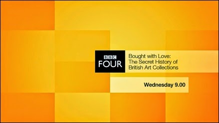
My idea for this one has been changing constantly with originally me wanting to base it on music and jazz, I may still do this but I am tempted to just do one animation, something quite clean, maybe with objects moving around, and later try and mirror it or layer it to create the 4 segments subtly.
These are celebrating digital channel of the year, which shows in the quality and a simple way to represent such a thing.
Above you cab see the sharp colours they have used trying to keep it quite sophisticated, they see them selves as a channel open to new ideas, and one that will are things you usually do not get the chance to see. an alternative channel for a slightly older age range then E4 effectively.
I do like the imagery, and how the images break up into those 4 areas that BBC4 seem to keep as a main signature. With there idents there is often just music, being used as a nice visual while the next show is introduced, unlike E4 which seems to have a lot of there idents as animations on there own, with there more refined ones like the walking E4 robot idents doing a similar thing to these ones.
also in line with BBC One and BBC Two, the channel logo is now unboxed and centred throughout trailers. But there is still anew end-board design to more closely fit in with the channel's idents and new promo.
Here they show the unboxed design, but it changed back into the box for clarity and recognition, also these idents advertise an up coming tv show or documentary of some sort in a very simple manor.


No comments:
Post a Comment