Monday, 11 November 2013
OSCILLATE - Daniel sierra
OSCILLATE from Daniel Sierra on Vimeo.
Oscillate is a group student animation focusing on movement and rhythm, using computer animation to create the crisp colourful movements to the music. It looks like a spiders thread being flicked and whipped as if shaking odd water drops. this animation builds up in colour and movement as if creating type of dust with a personality reminding me of space and how i would imagine nebulas to look like. The different shapes and the colours seem to be possibly live action being manipulated either with the music or by the music as the two in this seem to work together as one. id love to learn to create such crisp movements like tapping water.
Photography induction
We had a photography induction and was asked to consider the shot framing and composition, depth of field and lighting, shutter speed and aperture settings and how they may have an effect on our photographs we were asked to take for these two sessions.

contrast and lighting is what i was working with here trying to get the light balance right along with playing around with the IOS settings and aperture. we also used a (something table thing) to learn about behind lighting and illuminating out objects.

Here i played a little more with aperture, trying to get focus on just my clowns face which i found hard to manually focus whilst holding the camera so close. it would be alot easier if i had put my camera back on the tripos but i found it easier to find the angles by doing it this way and increasing the shutter speed in order to decrease shake, and increase the sharpness of the photo.


Here again we used a grey card in order to manually add white balance. we also played with filters in order to add shapes and different tones to our pictures. the one used on fiona was mean to give a slight window effect, which could be used in lighting in stop motion.

grey card used to get the colours right, which helped when photographing the fabric, allowing in the shades and colours of the fabric and other objects i photographed. I also photographed most the images in raw, apart from the bottom three in order to allow for a fast shutter speed.


To the left is before we used the reflector in order to balanced the colours with the grey card, and on the right is how using it managed to balance the white balance in the room and using the lights on the subject.


I turned off raw images here in order to get a fast shutter speed and capture the object in mid air, and capture the movement.
Sunday, 10 November 2013
Pixilation - predator and prey
PIXILATION - predator and prey
pixilation, incomplete but best out of the two from Bex on Vimeo.
we were asked to explore one of the following relationships
This is my final pixilation, well half of it as the weather conditions affected its completion although i do have a complete pixilation that did not turn out how i liked towards the bottom of the page.


Pixilation complete, but should be re-done. from Bex on Vimeo.
I research about parasite and there host to see exactly what they looked like and how they often affected each other, i also looked at bacteria and there alien like shapes to help me decide how i could go about filming anf planning out my pixilation. i decided to go with how the parasite can look but go with the tittle predator and pray rather then parasite but i am still a little undecided.


pixilation, incomplete but best out of the two from Bex on Vimeo.
we were asked to explore one of the following relationships
- Predator - Prey
- Host - Parasite
- Parent - Child
This is my final pixilation, well half of it as the weather conditions affected its completion although i do have a complete pixilation that did not turn out how i liked towards the bottom of the page.
Pixilation is only pixilation when a person is used, to make them look almost puppet like and animated. It uses the same techniques and ideas as stop motion uses.


I decided against using an egg and went with a carton and a glass instead which seemed to work well. I learnt alot about timing and movement from this project and will hopefully re-film this pixilation or soon create a new one that will hopefully turn out more successful and i will work out before filming what timings i need and story board the movements a little better, and realise again for next time the importance of lighting.
Pixilation complete, but should be re-done. from Bex on Vimeo.
I research about parasite and there host to see exactly what they looked like and how they often affected each other, i also looked at bacteria and there alien like shapes to help me decide how i could go about filming anf planning out my pixilation. i decided to go with how the parasite can look but go with the tittle predator and pray rather then parasite but i am still a little undecided.


The Bear and the Hare - John Lewis Christmas Advert 2013
I found this advert beautiful, how they used a real environment and put the drawn animals into the 3D world. To me it make it very close to home as you can relate to both. The story is also very simple about giving and making people feel special. I do rather like how john lewis have gone about there advert this christmas and i think its a very simplistic, disney inspired animation that will in turn help with there christmas marketing by giving it the personality of these characters, a bear and a hare two animals you would not usually put with one another. How the animals are reacting to the environment is amazing, as thi animation was created using stop motion.
Take on me - A-ha
Mixing live action with animation is always appealing to me, allowing the two movie techniques to work as one. The style goes very well with the period it was created, feeling very typical of the 80's. The way the animation looks hand drawn with charcoal to me is very aesthetically pleasing, along with how rough and sketched it looks giving it charm and personality.
Fritz the cat
Fritz the cat is a movie i like because of how controversial it must have been at the time, and probably still is when watching back alot of the content would still be seen to be offensive to many people. It covers alot of cultural stereo types of how people often perceived the city of new york at the time. But by allowing this film to be shown it opened the door for other X-rated animated entertainment leading to alot of adult animations we watch today on tv for entertainment. I love the style of the animation, especially how the backdrops are painted and the city scape, also how the animals fulfil certain stereotypes and the representations throughout the movie. alot of the animation in here to me is very trippy, in away reflecting the constant mention of drugs throughout the movie also.
T-shirt war - Rhett & Link
Now i found this stop motion very clever, as they did it through changing there shirts and interacting with them, so it could also be classed as pixilation to some extent. one thing i did wonder was how they managed to get back to the same positions each time after changing there shirts but depending what they were using they may have had software to track key frame positions which would make sense. Although the idea its self is really simple, coming up with the sequences, along with timings looks very difficult and scary to me, although the final product is an entertaining war between the guys shirts.
Alice - Jan Svankmajer
Alice is a czech version of alice in wonderland mixing stop motion with live action and a mix of other techniques by the animator Jan Svankmajer who is well knows for other very strange animations. The narration is entirely done by the girl, who speaks also for the rabbit and other characters within the movie. it was filmed in 1988 and was very popular at the time. i love this scene as you can see all the main elements, how they used a doll to show alice after she shrunk down, and you can also see her when she returns back to her actual size. the rabbit seems to just be a stuffed rabbit, full of saw dust which he keeps rubbing off his stop watch and eating. I really do love the props and the fact a doll was used within this, also the shots used, like the close ups of her hands and feet to help show the movement and detail. i feel the way they set out the rooms and props were very typical of parts of czech at the time as this wouldnt have been long after they broke off from Slovakia.
Dog of man - David Firth
I have always liked david firths work, although alot of it seems to be very twisted and make little sense, i think thats part of the charm with his simple animations which leave you feeling entertained and often a little weirded out. This animation for example although is just another odd animation by him, it has quite a sweet story about the relationship between man and dog, and to me him getting a tumour as a friend is as if he does not realise he has the dog until its to late. i do like this simple animation style and how so much can be said from so little. the very pale colours and obvious layers. i also enjoy the movement and would love to be able to create such animations over photoshop.
drawn pendulum
Kraak & Smaak 'Squeeze Me' - Wearewill
Kraak & Smaak from WEAREWILL on Vimeo.
This was a music video for the song squeeze me by kraak and smaak, and directed by andre maat and superelectric. Throughout the video multiple flipbooks are used animating what the characters in the video are doing, the flipbook was created through a pixilation technique mixing flipbook, with pixilation and a bit of animation added in after. i found this video very cleaver and drew me in as if it was preforming a magic trick. The books seem to help transform the room and actions of the people within it.
Dont hug me im scared - this is it
Don't Hug Me I'm Scared from This Is It on Vimeo.
This is a live action animation using puppets and actors. The whole thing is very aesthetically pleasing, with the props and set created almost entirely from felt and other materials. At first it feels like a child's show, like sesame street, but takes a darker turn later into the animation. the bold colours really give it that young appearance, and innocent opening with a very mixed approach later bringing hearts into the film changing the whole feel of it.
I love the puppetry the most in this, especially how it is used along side actors dressed in puppet like costumes. the attention to detail is great with even the fruit and keys made from fabric. i think the mouth on the note pad may be done with after effects but i cant be sure. also i like how they used computer drawn animation with it also.
Balloon - Apply
Balloon from Bex on Vimeo.
we were asked to create a final animation using of of the skills we had learnt during the animation skills brief. we were asked to create a 5-10 second animation, or 20-30 seconds if dont using pixilation. the words we were asked to explore were: longing, hate, love, lateness, surprise, happiness,sadness or fear. I decided to go with sadness and happiness and how quickly it can change.
This was my first complete drawn animation, consisting of 60 frames and lasting 5 seconds. I found timing to be one of the hardest parts of this task, as working out the movements ended up being very difficult. It was a different idea to start with which i have explained in another post, but i went for having a small child with a balloon or an ice cream as my main character and have them loose the balloon or the ice cream falling on the floor.


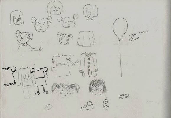
I used some large sheets of paper to try and design and plan my character design for my child, which i ended up deciding would be a girl. I messed around with a few ideas playing with the different outfits she could wear and how she would look. once i had my head around that i story boarded my idea which was easy as it was such a simple idea.


Originally i was going to colour her in, giving her a blue dress that changed to grey when she looses the balloon. but due to timing and not deciding how i would colour it i decided to just leave it as a line drawing and maybe leave the opportunity open to colour it in at a later date.


I found animating this way hard and very time consuming, although it is definitely a technique i want to practice and hopefully grow at it. The way i went about timing it was mimicking the actions and taking photos of myself posing for the kew frames i planned to include in my animation. because i was not sure how many frames i needed exactly between the kew frames i did not number them until later, making it very hard to not get confused by it all. This worked for me as i could fill in the extra frames needed later using the kew frames as a guide to where they should go and how they should look. I then put the animation together using quicktime and later changed the colour to make it black and white rather then showing the red pencil used.
Flip books
I scanned all my flipbooks for this project onto the computer and put them together into one short animation to make them easier to view.
New Project from Bex on Vimeo.
We were asked to practice using squash and stretch and to practice and get used to timings. One flip book had the ball bouncing across the page, the next was a ball just bouncing up and down and the last i attempted to create a ghost doing the mexican wave.
The larger ball dropping isnt fast enough and seems to go very slowly and just squish down where as the smaller ball seems to have better movement and a better bounce to it.
Chameleon - Apply

My original plan was to do a walk cycle of a chameleon walking past boring objects, or maybe a brick wall and finally coming across something more colourful like a brightly coloured ball or coloured graffiti on the wall. When talking to my tutor about it i realised for the time we had and the way i planned to animate it, it would be very hard to do as i wanted to do a separate background which would only be easily done on photo shop which i did not want to use for this task. although i did start to develop my ideas in other books and it may be an idea i choose to do at a later date.


Two little dicky birds
Two little dicky birds sitting on a wall,
One
named Peter, one named Paul.
Fly away
Peter, fly away Paul,
Come back Peter, come back Paul!

We were given a task to create a story board based on a nursery
rhyme, i decided on two little dicky birds as mine. We were told to
create no more then 12 frames on the story board. It took me a while to decide
on which rhyme to choose as they mostly seemed to be really simple like the one
i chose which means thinking of 12 frames worth of story was very difficult.
This was the same with the more complex rhymes although rather then not enough
information, two much seemed to be being told in the story making it hard to
translate and decrease.
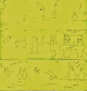

I decided i would go for a simple story and add a twist to the
story, like a back story to why the two birds flew off and then came
back.
Firstly we planned out our story boards using sticky notes to
plan it out first, that way we could easily move the story board and order of
the frames around and easily re-do them if needed before moving on to the
finalised story board.


As
the nursery rhyme two little dicky birds doesn't tell you much about
the birds, i decided to make a side story, giving some context to why the birds
flew away to help make an interesting and engaging animation out of it. I had
the two birds fly and sit on a wall waiting for a female bird to come who they
both have a liking for. She turns up and flirts on with them a little, before
flying off. they both in a struggle fly off after her pushing as they go not
realising she has flown to go see the big sexy bird on a tree in the park.
feeling defeated they fly back to the wall and make friends.As the
nursery rhyme two little dicky birds doesn't tell you much about the
birds, i decided to make a side story, giving some context to why the birds
flew away to help make an interesting and engaging animation out of it. I had
the two birds fly and sit on a wall waiting for a female bird to come who they
both have a liking for. She turns up and flirts on with them a little, before
flying off. they both in a struggle fly off after her pushing as they go not
realising she has flown to go see the big sexy bird on a tree in the park.
feeling defeated they fly back to the wall and make friends through
common grounds.
To create my final story board i first planned it out once more
in my sketch book, adding direction for the characters, like key movements or
station what kind of shot i was using, also using pen and water colour, later i
cut out the scenes in card, painting each with gouache.


Friday, 8 November 2013
Thought of you - Ryan Woodward
Thought of You from Ryan J Woodward on Vimeo.
This hand drawn animation is beautiful, showing such gracefully fluid movements, bringing a sketch to life, with a slight roughness to the characters giving them body and life. I like the simplicity and lack of colours, with the sketchiness of the characters adding to the movement and making it look very pencil drawn. The animator has interpreted the dance into this animation perfectly using all the rules of animation, including showing the arcs by leaving it the lines helping him create the movements and the stretches adding to the beauty of the piece. The over exaggeration along with the song tells a story which keeps you watching, and bonding with the characters.
Gulp - Aardman
Gulp. The world's largest stop-motion animation shot on a Nokia N8. from Nokia HD on Vimeo.
Gulp is the largest stop motion created on a beach by Aardman using a boat on its side, props and through manipulating the movement of the sand under the other props in use. It also uses the same camera as when they did a similar animation which the claim to be the worlds smallest animation in which they use he same type of camera phone to film the animation. Its a very simple concept showing a man at sea fishing. the way they manage to create the idea of a man in the boat by stuffing the clothes to create a full body. the movement is very fluid even though the scale is so large, they also do a very good job of not leaving marks in the sand when manipulating the background. Because of the character you forget its all stop motion and i personally for a moment thought it was pixilation, forgetting it wasn't a real guy in the boat.
Thursday, 7 November 2013
The maker -Zealous Creative
The maker is a short stop motion piece created by zealous creative who have produced a mixed range of stop motion animations. There are many aspects of this animation that really excite me, first of all is the detail to the props, including detail within the clothing of the models in the animation. i find it really enchanting with the detail even in the book and the small puts full of little bits and bobs, all the things you would think to find in such a room. also the rigging is amazing, how they manage to stand and move, along with how the camera is able to pan around the main character when he is playing the violin. the colours and the lighting for a room portrayed quite dark are lovely, with the gleam in the eyes. The story is also very simple, showing in a way the circle of life and how we create we teach what we know to others and learn our selves for the knowledge to be passed on and the cycle goes on.
Thursday, 31 October 2013
Strawberry Swing - coldplay
Strawberry swing is a stop motion, pixilation done on a pavement creating the illusion of a guy moving and interacting with his chalked surroundings. The crispness of the background is beautiful, making me wonder how they re-drew each frame without leaving left over smudge marks in the background. The artwork its self is beautiful full of colour, making the mane character appear to fly adding to the narrative in this full on superhero story told throughout. props are also used to interact with the background also with beautiful costume design creating a very light hearted feel to the story, mixing all kinds of shots used in cinema when drawing the scene within the animation.
Paranoid Android - Radiohead
This animated music video for radio head appeals to me because of its colour and style most of all. It had a very 90's feel, following a very similar style to a lot of animations in the 90s that i related to as a kid. The video tells a story along side the song, linking them together and making sense of the lyrics used. It uses bold bright colours, mostly animated on a computer. The shots are also really lovely, at 4:21 there is the shop of the boy sitting on the post from above giving perspective, along with the over exaggerated movements, making it seem very surreal.
Monday, 28 October 2013
Belly - Julia Pott
The artist Julia Pott talks about family bonds in this and her own inner struggles, through strange, awkward characters. To me it is something i can relate to, like how we find something or someone to lover and trust like a toy and loosing that one thing that is close to you. The style is very illustrated with a mix of clean cut shapes and styles with a mix or rough hand drawn textures. The way the characters sink and morphs really appeals to me. the layers and shapes used create a very space like world. I love the rough feel of the work, to me making it feel very personal, although certain aspects would appeal to me more if it was slightly softer or alot more rough in a hand drawn sense rather then fitting some place in the middle of the two.
Freeview Advert
I recently saw this advert for free view on the tv, i love the crisp cgi animation, and the simplistic idea behind it, about how entertainment doesn't always have to cost money. Along with making something like a tadpole seems enticing to just sit and watch, appealing to viewers childhood and how fascinating things can often appear. the movements within the animation, making the tadpoles dance with one another like a ballet under a pond. i especially like the character design of the fish and more so the pond, with detail in all aspects including the shopping trolly pulling in the more urban environment and making it look picturesque still. even the lighting hitting the plants and floor of the pond, bouncing off the moments within the animation.
BIG BANG BIG BOOM - Blu
BIG BANG BIG BOOM - the new wall-painted animation by BLU from blu on Vimeo.
Big bang big boom along with a few of Blu's other animations, and graffiti work is one of my favourite animations at the moment. One of the main reasons is probably because of the time put into it and the vast use of medias and techniques mixing stop motion with pixilation. The animation travels through a very urban environment using a mixture of spray paint and found materials to create the stop motion and movement, constantly changing in scale throughout. Blu is an a graffiti artist and animator who likes to let his work speak its self. Some pieces seem to have very little meaning where as pieces like this seem to have more to it about how beautiful the creation of it all may have been and how in a short time we are already destroying our own planet.
The sound without this animation is also beautifully composed for the video, helping emphasise the characters, movements and actions within the animation. building it up, going hand in hand with his work.
Subscribe to:
Comments (Atom)